
Get MAD with your data
A good dashboard (application, report or however you want to define it) needs to follow some rules of best practice design to be understood by the end user as successfully as possible
The following framework works especially well when you have a tool that allows filtering or slicing of data to be synchronised across pages.
The MAD framework is a 3-level approach defined as MONITOR - ANALYSE - DETAIL that allows the end user to flow through data using a top down approach to view data at the 3 levels of detail as required.

The MAD Framework
Monitor
This is really the 'Dashboard' part of the report.
A dashboard is a type of graphical user interface which often provides at-a-glance views of key performance indicators (KPIs) relevant to a particular objective or business process. In other usage, "dashboard" is another name for "progress report" or "report."
The dashboard should only be one or two sheets of a larger application. Think of the dashboard in your car, it's the area where we can get the key pieces of information that we require to monitor the consistent running of the car. A business dashboard is no different. It should convey, in the briefest of time, a quick snapshot of the required information to know at a high level the current status of the organisation.
If there is a change in the organisation performance such as the petrol is low, the engine is overheating or sales this year are down on last year, we use some form of indicator to point this out. It is this negative alert that encourages us to ask more questions and create an action to fix the performance.
These sheets typically have more KPI's and a few charts. [1]
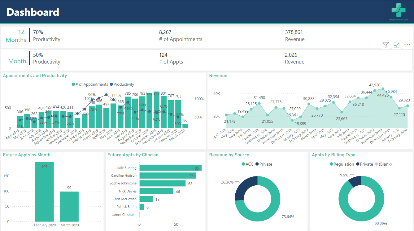
An example Monitor Page
Analyse
This next level gives us the ability to dig a little deeper to understand the issue, when we look at activities we can compare Country, Campaigns, Products etc. to see how each of those are doing in comparison to each other or to a different period and we can start identifying specific areas where there are issues.
Depending on the detail required each of these business areas could have their own sheet in a report to allow more analysis. At this stage it is good to have a tool that allows for selecting and filtering different dimensions (the describing data points) so that you can drill in and ask more questions easily.
These sheets typically have more charts and maybe a couple of KPI's, sometime a small table if it adds value

An example Analyse Page
Detail
Once you have drilled in and pinpointed a possible issue that needs to be dealt with - Your Actionable Insight - you may require some further detailed pieces of data. For example, a specific category may be performing much lower on average than others and you have identified something that may be causing it. Once you have drilled down to this key area, you might then want to be able to view all the details of what is happening.
These sheets typically are just a large table of transactional data that through the process of the Analysis level should have been filtered down to a quite specific set of data. You don't want to get here and still have 1000's of lines to trawl through.