
Data visualisation pitfalls

Color abuse
Do not overdo colours. Be aware that the wrong colour in the wrong place might cause confusion rather than clarity.
In the example to the right, colours have been added that do not add any value to the chart. Each of the bar could be analysis much easier and as effectively if they were all the same colour. This colouring just distracts from the information you are trying to convey, which is the relative size differences.
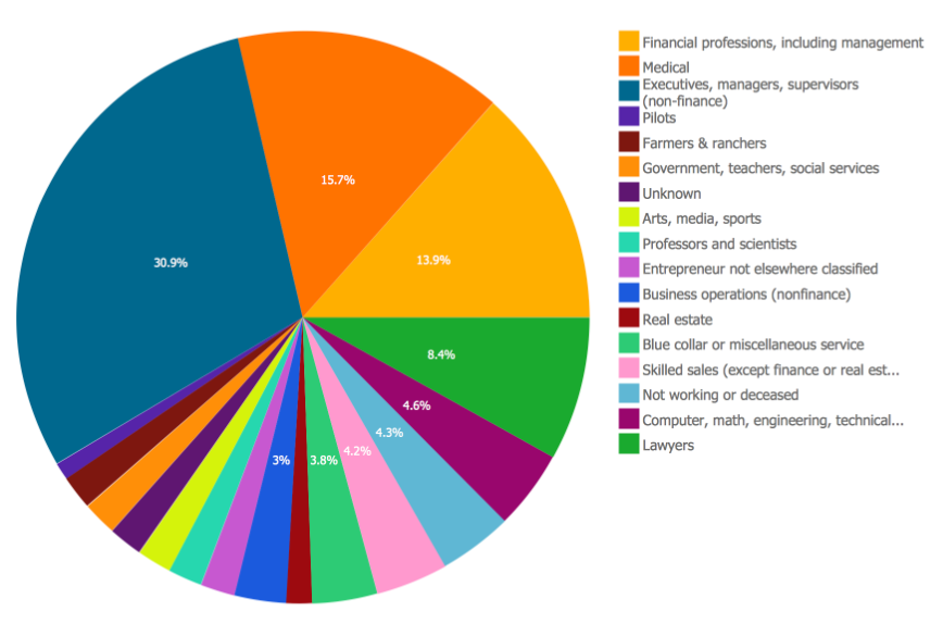
Misuse of pie charts
Avoid having pie charts side by side to compare. Or trying to squeeze too much information into them as we can see here.
The human eye finds it very difficult to discern the slight differences in the values here. A much better option would be to use a horizontal Bar chart. Use Bar charts when you have a maximum of 3 segments that have an easily noticeable size difference

Visual clutter
Too much information defeats the purpose of clarity. Use a maximum of nine Key Performance Indicators (KPIs) and remove all visual clutter.
Too much information in an app makes it difficult to see what is important. Today’s modern user interface style is a cleaner, simpler, flatter style of design. A simplified design subtly guides the reader and allows them to stay focused.

Poor design
A beautiful visualisation is not necessarily the most effective. Always use design best practices.
In the example the background image may be visually appealing, however it does not add value here and it removes focus from the data.
Bad data
Spot and correct issues with your data before you present it. Do not let your visualisation take the blame for bad information. Nothing will ruin the deployment of your report like bad data.
In our years of working with organisations, we have seen numerous good reports dismissed by the business because of small issue with the data. The users lose trust in the reporting and in those developing them.
Always thoroughly check your numbers to confirm correctness
This article is an except from our Data Visualisation Design eBook. Click Here to download the full book?