
Data Visualisation Elements
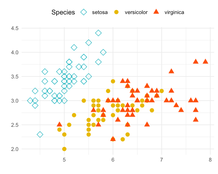
An effective visualisation is about how you design and make individual data elements stand out to reveal the data
In other words, the design of the individual elements of a visualisation should reveal the data to your users in a quick and intuitive way.
An easy way of achieving this is to use a different colour on one of the dots in a group of many dots. The different colour makes it much easier for you to find the dot and reduces your load of information.
Other examples of intuitive design are:
Position

Orientation


Size

Shape
Color hue, brightness and saturation

This article is an except from our Data Visualisation Design eBook. Click here to download the full book?